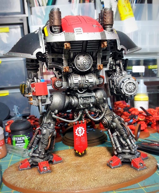
Not much to mention, painting-wise. Just a LOT of tedious line-highlighting to get through, one armour plate at a time. I do, however, have something to say about the decal sheet.
The quality is really something else. This is by far the finest sheet of decalsI've ever laid eyes on. Follow the tips on GW's video and you really can't go too far wrong.
However, I have one gripe. The back of the manual shows you which crest to put where and guess what? The size is WRONG. Here it can be seen that the row marked '3' is, according to the manual, supposed to be placed on the banner between the legs. Well, as you can see, it doesn't bloody fit. Suffice it to say, I was most annoyed by this.
Regardless, I soldiered on and after applying a few more decals, I think the banner looks rather good. Still... that damn crest is vexing...
Undaunted, I also saw fit to adorn the back of the banner somewhat. Nothing fancy, just a couple of decals and a little text...
Here's a closer look. Some of you may recognize that the decal in the centre of the cog is in fact taken from the Space Marine Vehicle sheet.
And here's where we are now, 9 days later. Pleased, I am :-)


No comments:
Post a Comment